Download the skill
It's a .zip file with the skill inside: the rules, the measures ready in CSS and an example form. You install it once and it stays saved in your AI.
download the skill (.zip) Using Claude? Don't unzip it. It takes the .zip just as you downloaded it.Install it where you use AI
Claude (web or app)
- Open Settings and go to Capabilities.
- Make sure code execution and file creation is on. Skills need it.
- In the Skills section, click upload skill and pick the .zip you downloaded.
- Turn on the form-spacing skill in the list.
- Open a new chat and ask for your form (examples in step 3).
Claude Code
- Unzip the file.
- Move the
form-spacingfolder into~/.claude/skills/(works for every project). - Reopen Claude Code and ask for your form.
ChatGPT or Codex
- Create a project in ChatGPT just for this.
- Unzip the file. Open
SKILL.md, copy everything and paste it into the project instructions. - Upload what's in the
assetsfolder to the project files. - In a chat inside the project, ask for your form.
form-spacing folder to ~/.codex/skills/.
How to ask
It works for any screen with fields: login, sign up, checkout, contact, booking, settings. In HTML, React, Tailwind and even Figma.
1"Create the sign up form for my website using the form spacing skill."2"My contact form looks cramped and uneven. Redo the spacing with the skill." (and send the file or a screenshot)3"Review the spacing on this checkout screen and tell me what's off."The measures it uses
All on the 4px grid. Save it for your next project, with or without AI.
The measures ready in CSS to paste into your project, a step by step on building the form in groups, the measures translated to Tailwind and to Figma auto layout, an example form with an error state and dark mode, and a checklist for the AI to run before handing it to you.
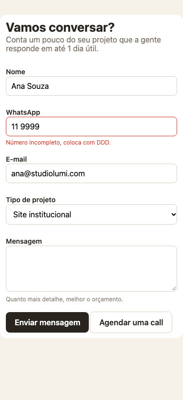
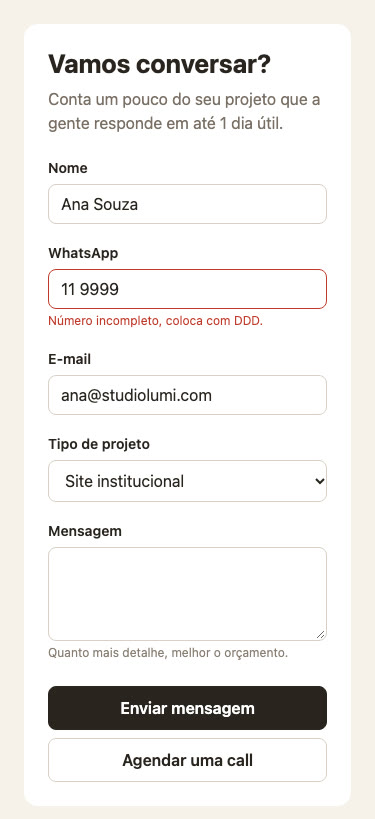
The same form, before and after
A contact form with eyeballed spacing, and the same form after asking the AI to fix it with the skill. The form is in Portuguese, the spacing speaks every language.
Fictional company, made up for the test.